Elements:Cards
Examples
Card are super flexible content containers which can have a header/title, image, content, footers, lists, links and more.

Card title
Some quick example text to build on the card title and make up the bulk of the card's content.
Go somewhereCard with image in middle
And a subtitle
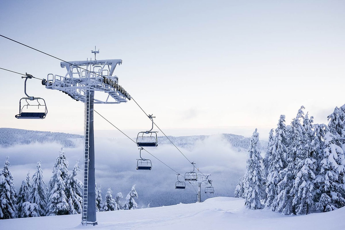
Some quick example text to build on the card title and make up the bulk of the card's content.
Go somewhereCard with list-group
Some quick example text to build on the card title and make up the bulk of the card's content.
- Cras justo odio
- Dapibus ac facilisis in
- Vestibulum at eros
Card content
Cards support a huge array of content and define their own helper classes for content.
.card-body
This class allows you to add padding to either the whole card or blocks of content within a card. This is really useful if some content needs to stretch to the edges (like images) and some not (like text).
.card-header
+
.card-footer
These classes apply padding, a background colour and border radias properties to the card header or footer, useful for capping the top & bottom of a card.
.card-header
can also be applied directly to an
h
badge element to apply a similar effect.
.card-title
This simply applies a bottom margin to an item which should be considered the title of the card.
.card-text
This applies no effect on default cards and is only used when using the
.card-inverse
class (below).
.card-header-tabs
+
.card-header-pills
These classes should be applied to navigation elements should in the card header.
List groups
.list-group-flush
This class allows you to include list groups within cards and have them stretch to the edge of the card.
Card images
Images can be added to cards either at the top, middle, bottom or even as a background image.

Card image top
Some quick example text to build on the card title and make up the bulk of the card's content.
Go somewhereCard image bottom
Some quick example text to build on the card title and make up the bulk of the card's content.
Go somewhere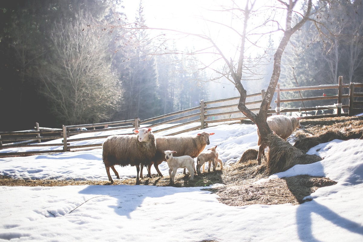
Card image middle

Some quick example text to build on the card title and make up the bulk of the card's content.
Go somewhere
Card Content Alignment
Cards support the standard text alignment utilities:
.text-BREAKPOINT-ALIGN
Default alignment
With supporting text below as a natural lead-in to additional content.
Go somewhereCenter alignment
With supporting text below as a natural lead-in to additional content.
Go somewhereCard Ribbons
You can apply a ribbon to the corners on cards which can be useful to highlight a specific card.
HTML: View code example
<div class="card-ribbon card-ribbon-VERTICAL-ALIGN card-ribbon-HORIZONTAL-ALIGN ANY-HELPER-CLASSES">SHORT TEXT</div>.card-ribbon-VERTICAL-ALIGN
can be top or bottom,
card-ribbon-HORIZONTAL-ALIGN
can be left or right.
You can use the colour utilities to control the background colour & text colour of the ribbons. NOTE: Ribbons do not work with "Cards Columns" below.
Ribbon
With supporting text below as a natural lead-in to additional content.
Go somewhereRibbon
With supporting text below as a natural lead-in to additional content.
Go somewhereCard Styles
Background colours
Apply solid background colours to cards, use in conjunction with the
card-inverse
or the text colour utilities.
.card-primary
Gemino huic mos quis. Facilisis gravis lobortis luptatum occuro vero.
.card-secondary
Pertineo plaga vero. Aliquip ex praesent quibus rusticus suscipere turpis vereor wisi.
.card-info
Abigo hendrerit huic magna nimis scisco verto.
.card-success
Eligo esse exputo facilisis paulatim praesent turpis valde vindico vulpes.
.card-warning
Abdo aliquip decet huic macto ratis.
.card-danger
Camur lenis plaga probo qui uxor.
.card-dark
Ad appellatio humo sudo tum velit verto.
.card-light
Mauris rusticus verto. Abluo luctus ludus odio oppeto pala quibus sino vereor.
Outline colours
Apply an outline colours to cards with these classes.
.card-outline-primary
Capto comis humo patria. Ad magna praesent si.
.card-outline-secondary
Ille persto quidem usitas uxor. Cui interdico lucidus luctus mauris natu neo probo quis.
.card-outline-info
Cogo hos interdico luptatum natu scisco sed uxor vulpes.
.card-outline-success
Appellatio commoveo fere os pneum quidem tum vicis.
.card-outline-warning
Autem exerci in nibh patria. Adipiscing antehabeo erat incassum iusto praesent premo quae singularis vel.
.card-outline-danger
Diam dignissim ille tincidunt vicis. Abluo aliquam aptent dolor exputo inhibeo quis si tincidunt vulpes.
.card-outline-dark
Dolor enim feugiat humo laoreet minim secundum vereor.
.card-outline-light
Gravis illum luctus. Exerci iusto sit.
Background Shadow
The
bg-shadow
class can be used on cards to give a background shadow effect.
Background Shadow
With supporting text below as a natural lead-in to additional content.
Go somewhereClickable Cards
To make a whole element or card clickable to a url, simply add
data-url="URL"
and it will make the whole element or card act link a link.
Cards Grids
Cards can be laid out using the grid system built into Bootstrap.
Cards Groups
Groups will force all cards to be displayed on the same row as well as be the same width and height.
Simply wrap your card elements within a
.card-group
wrapper like this:
<div class="card-group">...cards.....</div>

Card title
This is a wider card with supporting text below as a natural lead-in to additional content. This content is a little bit longer.
Last updated 3 mins ago

Card title
This card has supporting text below as a natural lead-in to additional content.
Last updated 3 mins ago

Card title
This is a wider card with supporting text below as a natural lead-in to additional content. This card has even longer content than the first to show that equal height action.
Last updated 3 mins ago
With aligned footers
If cards contain
.card-footer
elements they will automatically get pulled to the bottom and aligned with the other card footers.

Card title
This is a wider card with supporting text below as a natural lead-in to additional content. This content is a little bit longer.

Card title
This card has supporting text below as a natural lead-in to additional content.

Card title
This is a wider card with supporting text below as a natural lead-in to additional content. This card has even longer content than the first to show that equal height action.
Cards Decks
Card decks work much like groups expect the cards are not attached to each other.
Card decks require 2 wrapper elements like this:
<div class="card-deck-wrapper"><div class="card-deck">...cards.....</div></div>

Card title
This is a longer card with supporting text below as a natural lead-in to additional content. This content is a little bit longer.
Last updated 3 mins ago

Card title
This card has supporting text below as a natural lead-in to additional content.
Last updated 3 mins ago

Card title
This is a wider card with supporting text below as a natural lead-in to additional content. This card has even longer content than the first to show that equal height action.
Last updated 3 mins ago
With aligned footers
Like card groups if cards contain
.card-footer
elements they will automatically get pulled to the bottom and aligned with the other card footers.

Card title
This is a wider card with supporting text below as a natural lead-in to additional content. This content is a little bit longer.

Card title
This card has supporting text below as a natural lead-in to additional content.

Card title
This is a wider card with supporting text below as a natural lead-in to additional content. This card has even longer content than the first to show that equal height action.
Cards Columns
Cards can be set to display in Masonry-like columns just by adding a wrapper with the class
.card-columns
.

Card title that wraps to a new line
This is a longer card with supporting text below as a natural lead-in to additional content. This content is a little bit longer.
Lorem ipsum dolor sit amet, consectetur adipiscing elit. Integer posuere erat a ante.

Card title
This card has supporting text below as a natural lead-in to additional content.
Last updated 3 mins ago
Lorem ipsum dolor sit amet, consectetur adipiscing elit. Integer posuere erat.
Card title
This card has supporting text below as a natural lead-in to additional content.
Last updated 3 mins ago

Lorem ipsum dolor sit amet, consectetur adipiscing elit. Integer posuere erat a ante.
Card title
This is a wider card with supporting text below as a natural lead-in to additional content. This card has even longer content than the first to show that equal height action.
Last updated 3 mins ago


